© Judy Davis/HDPhoto
Context
Flight Centre is Australasia's best known travel agency with more than 2000 shops and businesses in 11 countries. The Americas business is Flight Centre’s largest operation outside Australia and consists of more than 550 shops and businesses across the leisure, corporate and wholesale travel sectors.
Our team was engaged by Flight Centre to design a progressive and evocative new American headquarters which reflected their unique culture and gave their 300 employees an efficient, engaging, and inspiring workplace. The new location covers 70,000 sf of office space over one and a half floors. The wide-open floor plan resulted in just a few walled offices or conference rooms, so our strategy took full advantage of all available vertical (and a few horizontal) surfaces.
Concept
As the parent of a large and growing family of brands, at the time of our project Flight Centre's identity was nebulous at best. To create a "branded" environment without the luxury of a solidified brand, our strategy centered around bold and captivating graphics to create impact, inspired by content that would never go out of style: the golden age of travel.
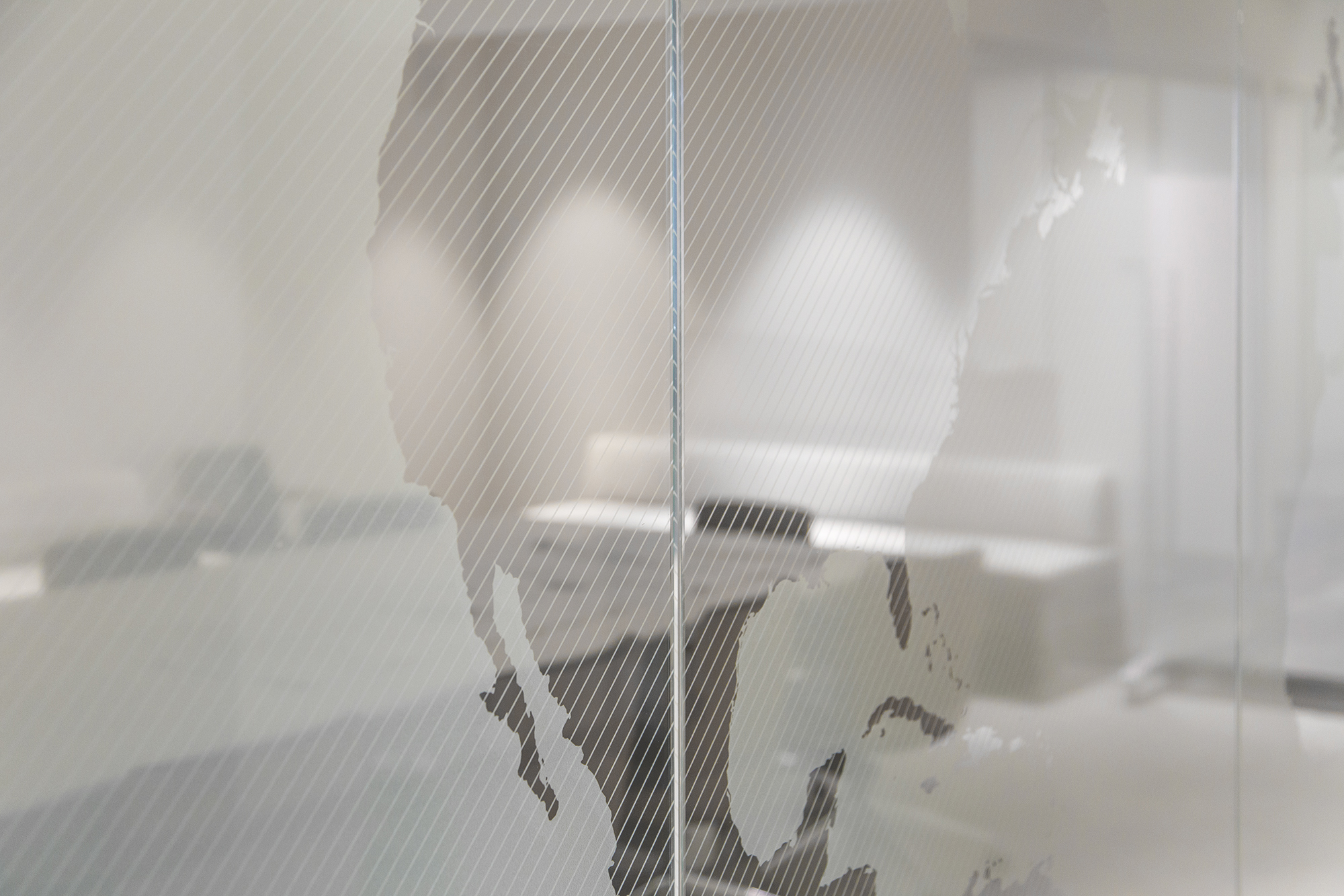
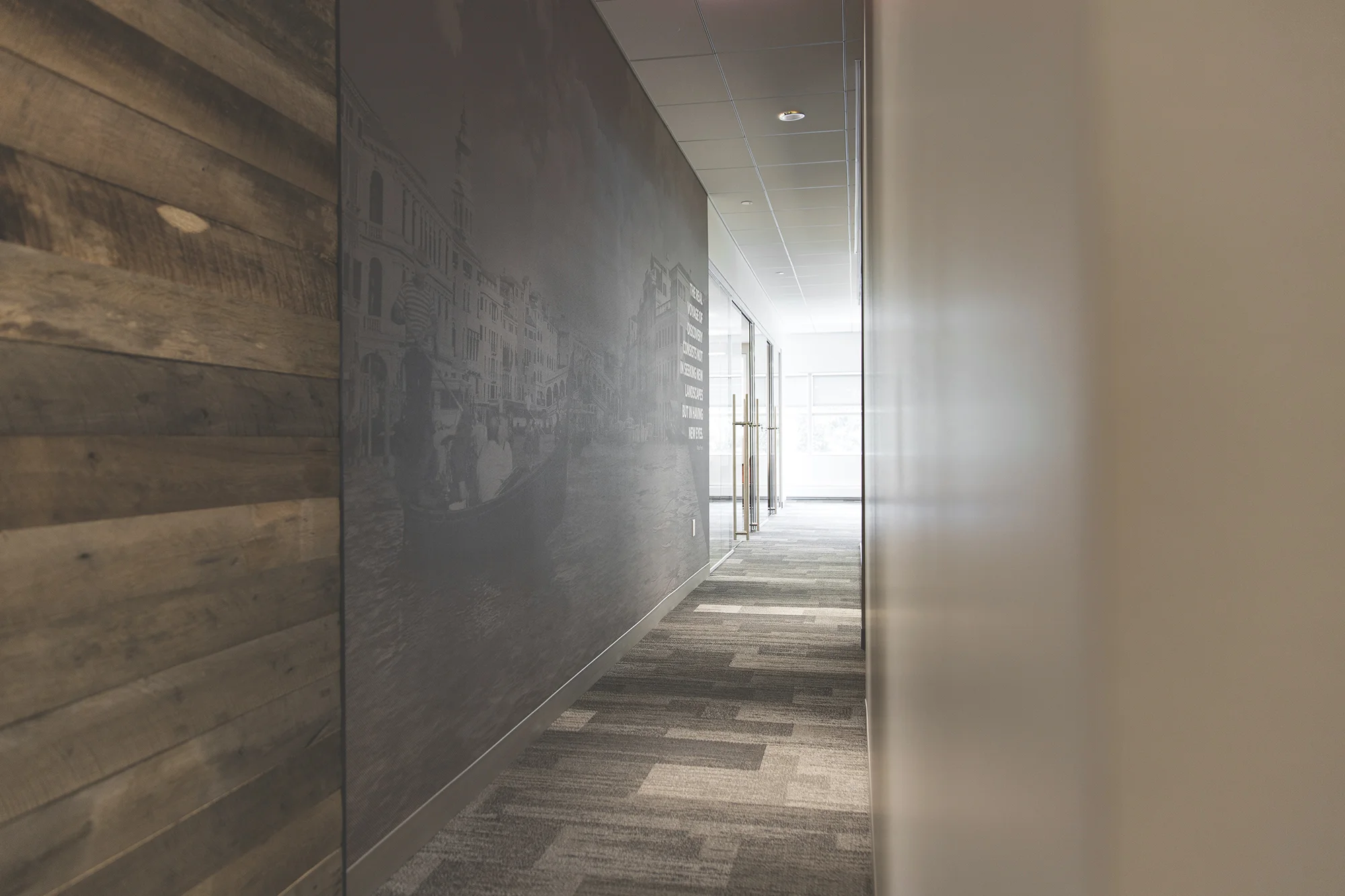
In keeping with the company’s purpose, “to open up the world for those who want to see”, walls and glass partitions feature colorful or transparent floor-to-ceiling images of iconic travel destinations, overlaid with famous quotes from leading figures of that region. Framed vintage travel posters remind us of the romance of travel, and international airport codes are repurposed as custom distraction markings for full height glass partitions.
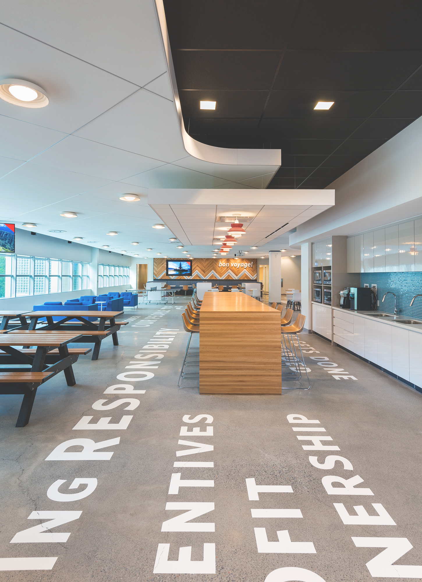
The heart of the office, serves as gathering space for team rallies, a launchpad for trainees, a dining hall, and a cocktail lounge. The "Lido Deck", as it was dubbed, is fully equipped with a well-stocked bar, ping pong, table arcade games, TVs, bleacher seating, and a full-size shuffleboard court. To ground the fun and frivolity we painted oversized company values on the polished concrete floors, applied dimensional letters shouting ‘Bon Voyage’ on top a nautical chevron backdrop, created a custom neon bar sign, and marked the central column with a playful Mai Tai icon.
As homage to the group's irreverent culture wayfinding icons and tongue-in-cheek cultural symbols applied like graffiti identify office zones. Behind the scenes, a secondary layer of interactive ‘Discovery’ graphics provide employees with opportunities to collaborate, engage, and express themselves: including a usable lettered chalk-wall, super-sized wall magnets and a gigantic dry-erase sticky note with the prompt, "I'd rather be...".
Contribution
Environmental Graphic Design
SIGNAGE & Wayfinding
Visual Design
© Judy Davis/HDPhoto


